In versions of SkyVault Share previous to 4.0, the client-side JavaScript requested JSON data from the repository directly via the proxy servlet. From v4.0, there is a new data web script (at /components/documentlibrary/data/) thst requests data from the repository and processes the response based on a configurable set of evaluators before finally returning JSON data to the browser.
All configuration for, and evaluation of, Document Library status indicators, metadata templates, and actions is now on the web tier instead of split between the repository and the browser.
1. Web tier configuration overview
The individual action configuration files (e.g. documentlist.get.config.xml, document-details.get.config.xml) have been removed and all actions are now defined within common, easily over-ridable config sections.
The new or altered areas of configuration in share-documentlibrary-config.xml are:
| DocumentLibrary |
|
| DocLibCustom |
|
| DocLibActions |
|
Also new to v4.0 is the slingshot-documentlibrary-context.xml file containing all bean definitions for web tier evaluators.
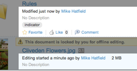
2. Status indicators
 |
|
The status indicators are located in the <indicators> config container element with the following structure:
<indicator id (index) (icon) (label)>
    <evaluator />
    <labelParam index />
    <override />
</indicator>
where:
| <indicator> | Status indicator element with the following attributes:
|
| <evaluator> | Bean id of evaluator that determines the visibility of the image. The Evaluator extends org.alfresco.web.evaluator.BaseEvaluator |
| <labelParam> | Allows placeholder values within i18n label to be replace at runtime with node
properties. The value is the replacement string or dot notation path to a node property.
The attribute is:
|
| <override> | Allows this indicator to override (hide) other indicators that would otherwise be visible. The value is the id of another indicator to override. |
Example config
<indicator id="google-docs-locked" index="10">
    <evaluator>evaluator.doclib.indicator.googleDocsLocked</evaluator>
    <labelParam index="0">{jsNode.properties.owner.displayName}</labelParam>
    <labelParam index="1">{jsNode.properties.owner.userName}</labelParam>
    <override>locked</override>
</indicator>
A note about the labelParam value: refactoring on the client-side (JavaScript code) means that a common helper object is available for each node within the Document Library during the rendering cycle, namely jsNode. A full reference for this new resource is in jsNode reference.
3. Metadata templates
The metadata template refers to the section of the document “browse” page under the filename. New functionality in Version 4.0 allows this area to be customized with node properties and/or by custom rendering functions.

In a clean install, there are two templates defined: the default (fallback) template and one used when rendering working copies. These are both defined within share-documentlibrary-config.xml and can be extended or overridden as required (via share-config-custom.xml).
The metadata templates are located in the <metadata-templates> config container element with the following structure:
<template id>
    <evaluator />
    <line id (index) (simpleView) (evaluator) />
    <override />
</template>
where:
| <template> | Template element with the following attribute: |
| <evaluator> | Bean id of evaluator that determines whether the template is to be used for this node or not. The Evaluator extends org.alfresco.web.evaluator.BaseEvaluator |
| <line> | Allows placeholder values within i18n label to be replace at runtime with node properties. The value refers either to a node property (such as cm_description) or a customer JavaScript renderer. To add a label in front of the property, add the label's i18n messageId after the property value, separated by a space (such as {cm_description details.description}. The attributes are: |
Example config
<template id="isPhoto">
   <evaluator>evaluator.doclib.metadata.hasExif</evaluator>
   <line index="10" id="date" view="detailed">{date}{size}</line>
   <line index="20" id="exposure" evaluator="evaluator.doclib.metadata.hasExposure">
      {exposure exif.label.exposure}
   </line>
   <line index="30" id="description" view="detailed">{description}</line>
   <line index="40" id="social" view="detailed">{social}</line>
</template>
Custom JavaScript renderers
A renderer can either be a simple property value, or use a custom JavaScript renderer. To register a custom renderer, fire a Bubbling (global) event, passing-in the renderer id and the rendering function:
if (Alfresco.DocumentList)
{
    YAHOO.Bubbling.fire("registerRenderer",
    {
        propertyName: "renderer id",
        renderer: function(record, label)
        {
           return "...";
        }
    });
}
The rendering function should return property escaped HTML.
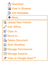
4. Actions
In versions previous to v4.0, the actions configuration was spread throughout a number of web script XML config files. From v4.0, actions are all now defined globally in the share-documentlibrary-config.xml file, in the DocLibActions config section. This means they can be overridden and extended via a share-config-custom.xml file. These customizations can be via AMP, JAR or web-extension folder mechanism, or a mixture of all three.
Actions are also now grouped by view type instead of node “state”.

The actions are located in the <actions> config container element with the following structure:
<action id type (icon) label>
    <param name />
    <evaluator negate />
    <permissions>
      <permissions allow />
    </permissions>
    <override />
</action>
where:
| <action> | Action config container element with the following attributes: |
| <param> | Action parameter elements with the following attribute: |
| <evaluator> | Bean id of evaluator that determines whether the action is valid for this node or not. Evaluator extends org.alfresco.web.evaluator.BaseEvaluator and contains the following attribute: |
| <permissions> | Permission config container element |
| <permission> | List of permissions required for the actions, as defined in the
applicationScriptUtils bean config with the following attributes: Only one of the "allow" or "deny" permissions can be specified |
| <override> | If this action should override the visibility of other actions, they are specified using this element. |
Example config
<!-- Inline edit -->
<action id="document-inline-edit" type="pagelink" label="actions.document.inline-edit">
   <param name="page">inline-edit?nodeRef={node.nodeRef}</param>
   <permissions>
     <permission allow="true">Write</permission>
   </permissions>
   <evaluator>evaluator.doclib.action.inlineEdit</evaluator>
   </action>
<!-- Checkin from Google Docs -->
<action id="document-checkin-from-googledocs" type="javascript" label="actions.document.checkin-google">
     <param name="function">onActionCheckinFromGoogleDocs</param>
     <evaluator>evaluator.doclib.action.googleDocsCheckIn</evaluator>
     <override>document-checkout-to-googledocs</override>
     </action>
<!-- View in Explorer client -->
<action id="view-in-explorer" type="link" label="actions.folder.explorer-view">
  <param name="href">{explorerViewUrl}</param>
  <param name="target">_blank</param>
  <evaluator>evaluator.doclib.action.viewInExplorer</evaluator>
</action>
5. Action groups
Actions are grouped using the actionGroup elements. The type of node and also the view currently in use determines the actual group used. The group is calculated by the calculateActionGroupId() function in surf-doclist.lib.js and is designed to be overridden if many new and/or altered actions are required .
The action groups defined in a default installation are:
| Action Group id | Default Usage |
| document-browse | Documents on the browse page |
| document-details | Document on the document details page |
| folder-browse | Folders on the browse page |
| folder-details | Folders on the folder details page |
| document-link-browse | Links to documents on the browse page |
| document-link-details | Links to folders on the document details page |
| folder-link-browse | Links to folders on the browse page |
| folder-link-details | Links to folders on the folder details page |
The action groups are located in the <actionGroups> config container element with the following structure:
<actionGroup id>
    <action />
</actionGroup>
where:
| <actionGroup> | Action group config container element with the following attribute: |
| <action> | Action element with the following mandatory attribute: |
Other actions properties are over-ridable here, although it is recommended from a maintenance view to only override "simple" properties like the icon and label. These make it possible to reuse an action with document-biased icon and label to be used for folders.
Example config
<actionGroup id="folder-browse">
    <action index="100" id="folder-view-details" />
    <action index="110" id="folder-edit-properties" icon="folder-edit-properties" />
label="actions.folder.edit-metadata" />
</actionGroup>
6. Custom client extensions
The DocLibCustom config section is where dependencies on custom client-side assets can be defined. These are defined in exactly the same way as for custom Forms dependencies.
The client-side dependencies are located in the <dependencies> config container element with the following structure:
<css src />
<js src />
where:
| <css> | Stylesheet dependencies element with the following attribute: |
| <js> | JavaScript dependencies element with the following attribute: |
Other actions properties are over-ridable here, although it is recommended from a maintenance point of view to only override "simple" properties like the icon and label. These make it possible to reuse an action with documen-biased icon and label to be used for folders.
Example config
<dependencies>
    <cs src="/custom/my-customization.css" />
    <js src="/custom/my-customization.js" />
</dependencies>
